Building a website has never been easier. And yet never have so many of them looked identical.
That is no accident — it is the result of two waves of uniformity. First came free WordPress themes and ThemeForest: thousands of businesses with the same Avada, Revolution Slider, and the identical hero-features-about-contact layout. Then came AI. Tools that generate sites from a prompt deliver something that looks correct in minutes, but doesn’t look like you. The same layout, the same impersonal aesthetic, the same stock photos with a gradient.
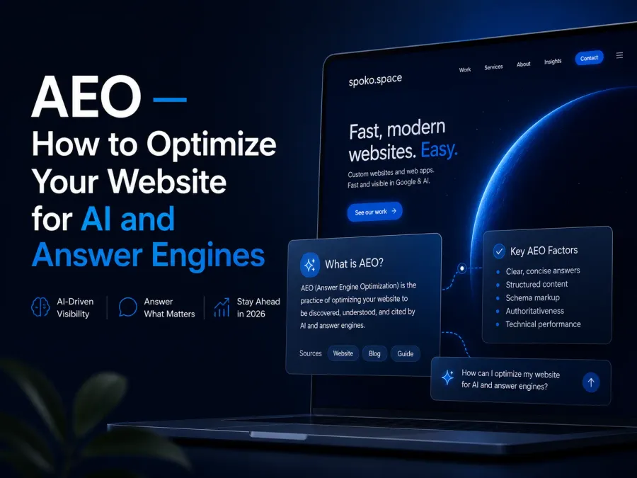
The paradox: Anthropic — the creator of Claude — actively hires designers and launched Claude Design as a tool for non-designers, not as a replacement for their own team. AI is a tool, not an author. A modern website is the result of design decisions, trend awareness, and technical skill — not just a prompt.
This article collects the trends, navigation patterns, and concrete techniques that in 2026 separate memorable sites from those you scroll past and forget.
Visual and Layout Trends
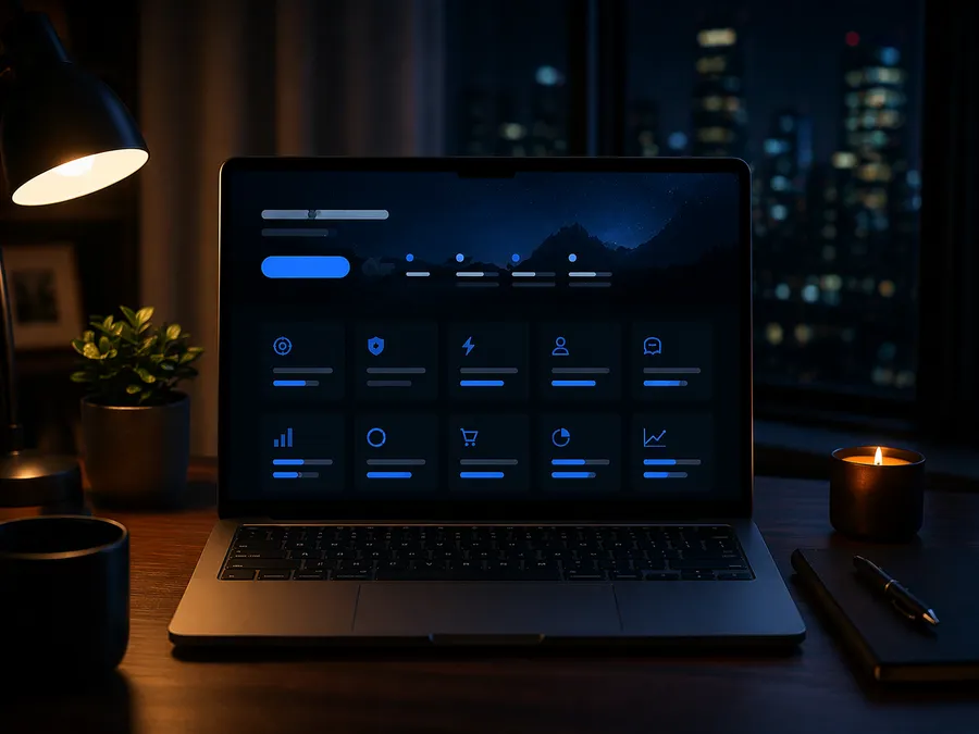
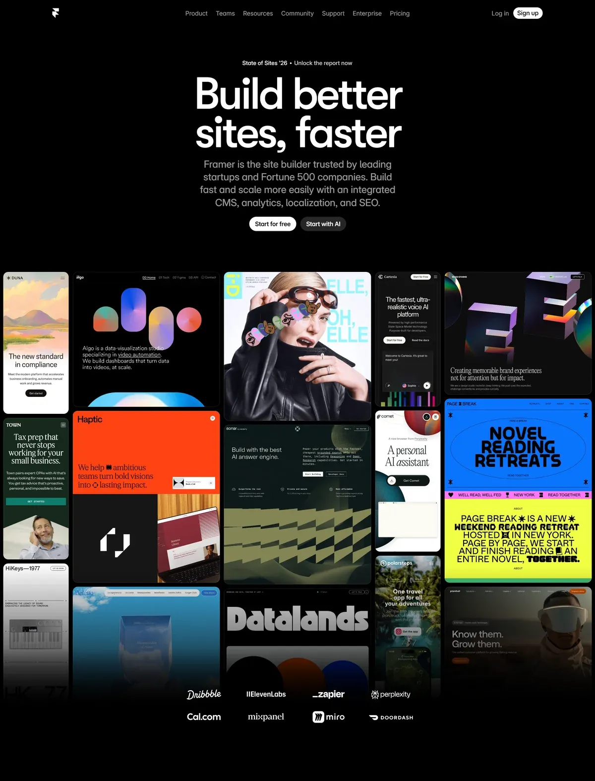
Bento grid
A layout inspired by the Japanese bento box — tiles of different proportions arranged in an asymmetric grid. Apple popularised this pattern when presenting iPhone 15; since then it has become the standard on SaaS and product pages. In 2026 the bento grid goes active: hovering a tile no longer just changes colour — the tile slides open, plays a video, or reveals an additional layer of content.
Dark mode 2.0
Dark mode is no longer just an accessibility toggle — it is becoming a full visual identity. Pure black (#000000) on OLED draws zero power and saves up to 47% of battery. Tech, gaming, fintech, and luxury brands are leading with dark-mode-first — saturated accent colours pop far better on dark backgrounds than on white.
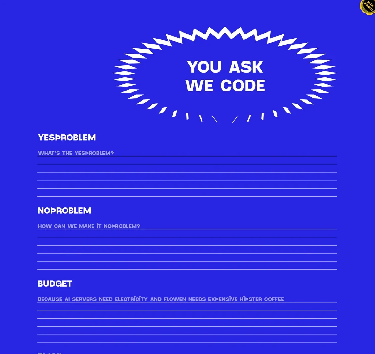
Neo-brutalism
A counter-reaction to years of uniform, sterile minimalism. Thick borders, vivid colours, deliberately “raw” elements, asymmetry. Used by challenger brands, startups, and creative agencies that want to stand out. Mailchimp, Figma in their campaigns, many independent designer portfolios. Not for everyone — but where it works, it works hard.
Glassmorphism
Transparent panels with frosted glass and backdrop-blur. Works well in dashboards, fintech apps, and SaaS on dark backgrounds. The trap: overused it loses legibility — works as an accent, not as an entire system.
Noise, texture, grain
A reaction against the sterile AI-generated aesthetic. Grainy backgrounds, noisy gradients, paper texture — restore organic feel and make the site look human-made for humans. Simple to implement: just a low-opacity SVG noise overlay as background-image.
Organic shapes and curves
Sharp rectangles are giving way to wavy section dividers, blob shapes, and irregular containers. Sites with organic shapes literally “breathe” differently from those built entirely from boxes.
Barely-there minimalism
At the opposite pole from neo-brutalism: one font family (two typefaces at most), two or three colours, white space as a structural element — not empty space. Works for premium services, law firms, architecture practices.
Typography as a Graphic Element
In 2026 typography has stopped being just a carrier of text — it is a visual element on equal footing with photography.
Kinetic typography — headlines that build letter by letter, text responding to scroll position, variable fonts transitioning smoothly between weights. A single font file that can be both weight 100 and 900 — enabling animations that five years ago required multiple files or Canvas.
Oversized headlines — a heading occupying the full viewport width, often deliberately clipped at the screen edge as a typographic device. Text does not have to “fit” — it can overflow the screen.
Text filled with an image — background-clip: text and mix-blend-mode let a photo “shine through” the letters or merge with the text. An effect impossible to achieve with a plain template.
CSS only — no extra elements
Animations and Interactivity — 2026 Techniques
CSS scroll-driven animations — no JavaScript
The biggest change in the animation layer in recent years: native CSS animation-timeline: scroll() and view() let you build scroll-based animations without a single line of JavaScript. They run off-thread, on the GPU, and never block the main thread. Full support in Chrome/Edge from version 115, Safari 18 and later.
@keyframes fade-in {
  from { opacity: 0; transform: translateY(20px); }
  to   { opacity: 1; transform: translateY(0); }
}

.section {
  animation: fade-in linear both;
  animation-timeline: view();
  animation-range: entry 0% entry 30%;
}
When this is not enough — GSAP + ScrollTrigger for complex sequences, SVG morphing, and text animations. Lenis as the smooth scrolling standard (replaced Locomotive Scroll in most projects) for momentum scrolling without jitter.
This site (spoko.space) uses animation-timeline: view() to animate the hero section and section entrances on scroll — without a single line of JavaScript. Scroll the widget below to see the effect:
↓ Scroll inside this box
Pure CSS — animation-timeline: view() — no JavaScript
Micro-animations
Hover on a button, focus state, loading skeleton, success/error feedback — each of these interactions should have its own animation. A subtle one. Micro-animations that are too loud irritate; those that are well calibrated build an impression of quality and finish.
↓ Hover over each element
Card
Magnetic buttons
Buttons that “attract” the cursor towards them when it enters the element’s area. The magnetic effect implemented in a few dozen lines of vanilla JS or via Motion.dev. Looks impressive, strengthens CTAs.
↓ Hover over the buttons
Custom cursor
Replacing the system pointer with an element consistent with the visual identity. Trail effects, adaptive morphing (the cursor changes shape/colour when hovering over interactive elements), circle follower with a delay. Requires care on mobile — there is no cursor on touch devices.
Navigation — The Evolution of the Menu
Navigation is one of the areas where unconsidered decisions translate directly into lost users.
Hamburger menu — when it helps and when it hurts
Before discussing when to use it, note that “hamburger” is not the only option — a menu icon can take many forms and animations. Click to see the possibilities:
The hamburger makes sense when: the structure has more than 7 items that cannot be grouped, the site is content-first (articles, video) and navigation is occasional, or when it is an additional menu alongside a main one.
The hamburger hurts when: it is the only navigation for key sections on mobile, the primary CTA is hidden inside it, or returning users must open it every single time.
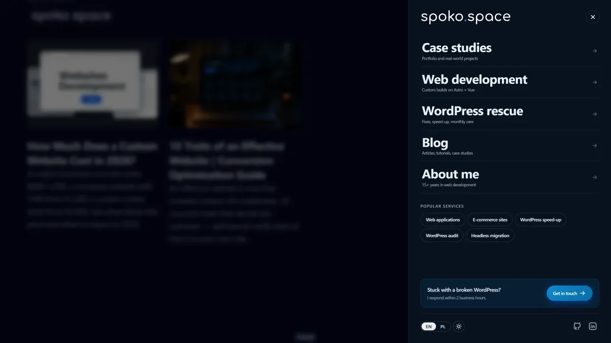
Drawer / slide-out panel
A panel that slides in from the side (or bottom) with a backdrop overlay — the evolution of the hamburger. Best practices: entry animation 250–350ms ease-out, backdrop blur instead of a dark overlay, close by clicking outside the area or swiping. Works well in complex sites where you need to show more options without occupying screen space.
Below — an interactive demo of the pattern I use on spoko.space: panel from the right, backdrop blur, hierarchy (primary links → service chips → CTA card), close by clicking the backdrop or pressing Esc:
Bottom navigation — the app-like pattern
On mobile, more and more sites are switching to a bottom nav (tab bar): 3–5 icons + labels in a bottom bar, within thumb reach. UX research shows significantly higher engagement compared to hamburgers for returning users. Think of your site as an app — because that is how the user experiences it on a phone.
Sticky + scroll-hide navbar
A navigation that “hides” when scrolling down and reappears when scrolling up — the classic pattern (known as “hide on scroll down, show on scroll up”). Saves viewport space on mobile, returns when the user signals they want to navigate.
Mega menu
On desktop for complex sites (agencies, SaaS platforms, e-commerce): a panel with images, featured links, and a short category description. Visible immediately — no hover mystery. Wins over deep hierarchies of dropdown menus.
Performance — Speed as Part of the Design
A modern website is not just something that looks good — it needs to load fast. Core Web Vitals are Google’s technical benchmark for user experience, and since 2021 they directly influence search rankings.
Three metrics that matter in 2026:
INP replaced FID as a Core Web Vital in March 2024. A value above 500 ms usually points to a JavaScript architecture problem — the page is doing too much on the main thread.
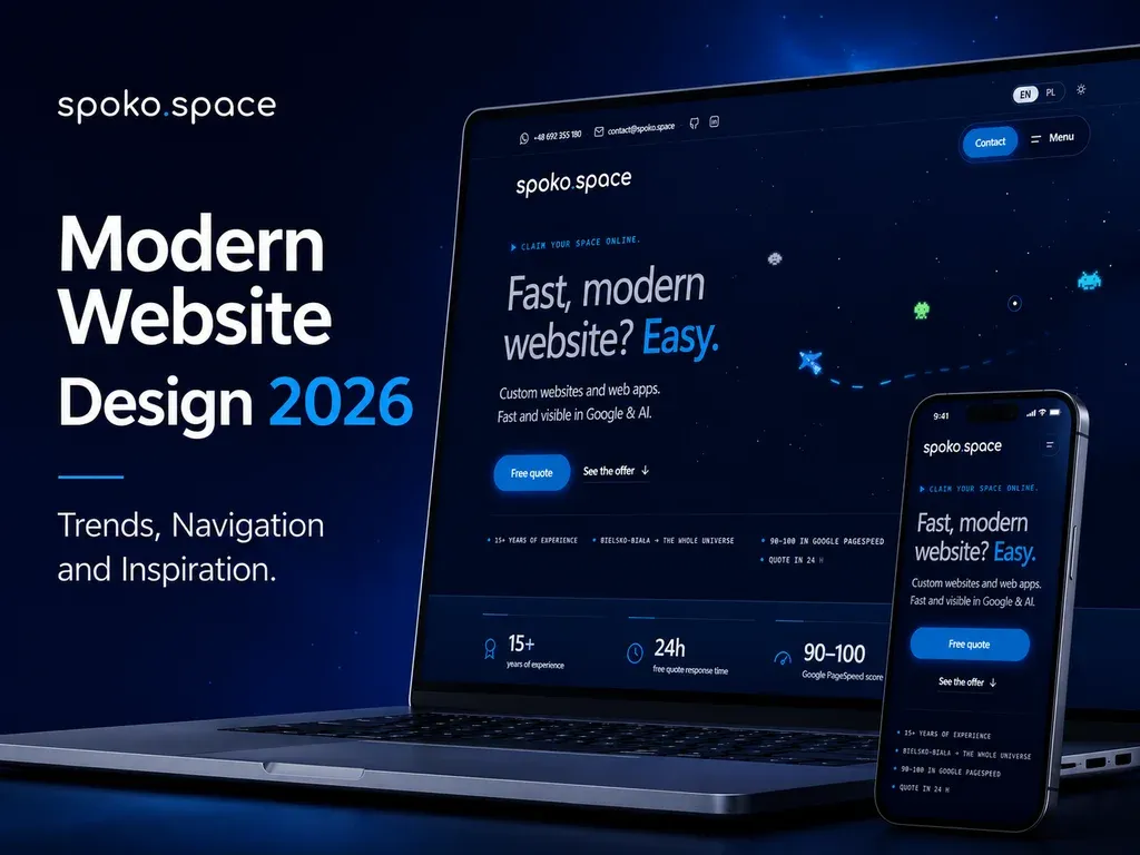
The fastest sites in 2026 are built with static generation (SSG) or server-side rendering (SSR) — not client-side JavaScript frameworks that push rendering to the browser. This site (spoko.space) is built in Astro and scores 95–100 on PageSpeed Insights on every page. A typical unoptimised WordPress site with many plugins sits at 40–60.
How to check: PageSpeed Insights — paste your URL, get a 0–100 score. 85+ is good; 95+ is excellent. Fast loading is also the first of the 10 traits of an effective website.
For a deeper look at Core Web Vitals and how technology choices affect Google rankings, see Core Web Vitals — a practical guide and Web technologies and SEO ranking in 2026 on uper.pl.
What Works in 2026 and What Doesn’t
Where to Find Inspiration
Sites I actively browse when designing — not as ready-made recipes to copy, but as a starting point for my own decisions.
Awards & High Standards
Landing Pages & SaaS
Interactions & UX Patterns
Mobile & Apps
Typography & Layout
Concepts & Experimental
Summary
A modern website in 2026 is not about adding the trendiest effect. It is the result of design decisions at every level: how navigation is organised, how the site behaves on a phone, whether animations help understand the content, whether the visual identity is consistent and memorable.
Key takeaways:
- Uniformity is a real risk — templates and AI generate sites quickly but identically. Investing in an individual design sets you apart from hundreds of identical competitors.
- Mobile navigation is a priority — bottom nav, animated drawer, sticky-hide navbar. Hamburger as the only solution is a decade-old decision.
- CSS scroll animations without JS — native
animation-timelineworks better than libraries, requires no dependencies, and is production-ready. - Trends are tools — bento grid fits SaaS, not a law firm; neo-brutalism works for a creative agency, not consumer electronics e-commerce. Choose consciously.
- Inspiration is at hand — awwwards, land-book, godly, hoverstat.es. Browse regularly, not only when a project starts.
- Performance is part of the design — LCP, INP, CLS are not just developer concerns. A slow site loses users before they see any of the visual work. Check PageSpeed Insights before launch.
Building a site from scratch or considering a redesign? At spoko.space I design and build sites in Astro — fast, semantic, with an individual visual identity. Get in touch and I will describe exactly what is worth changing in your case.