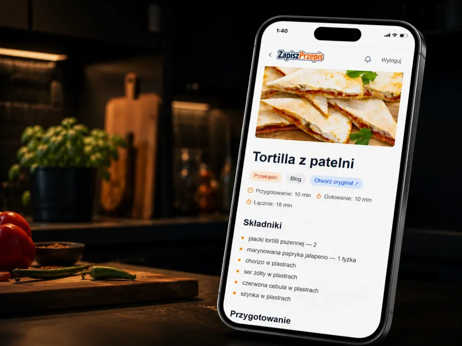
I don’t start visual changes to a site or an app in code. First come mock-ups made with AI, most often in Claude Design: several versions of the same screen side by side, clickable, with real content in them. I pick one or build a new one out of them, and only a finished package of screens and a list of changes goes into code.
That’s how I redesigned ZapiszPrzepis this autumn, an app for saving recipes from the web. One Claude Design project grew to more than twenty screens:

One note before I start: the standalone Claude Design app at claude.ai/design only runs until 14 December 2026. After that, design happens in Claude itself, and old projects have to be moved. The way of working described below stays the same. What to do with your projects is at the end of the post.
I start with a description and pictures
First I write what I want to change and for whom. In ZapiszPrzepis the audience mattered most: older people use the app too, so the text has to be large, the buttons easy to hit and every icon labelled.
I often add screenshots from other apps and sites: a layout I like, a way of showing a list, a typeface. Words leave a lot of room for interpretation. A picture settles what we are talking about.
Claude Design also reads the app’s code from the repository. So the “current version” mock-up reproduces what actually runs in production, not what I remember of it.
Several proposals instead of one
Instead of one design I ask for two or three that differ clearly. For the home page redesign there were three directions:
- A: search first, everything else in the menu.
- B: fixed navigation, a bottom bar with five tabs on the phone and a side panel on the desktop.
- C: large text, high contrast and fewer things at once.

Each proposal has several screens: the home page for a guest and for a signed-in user, search results, a recipe. Only a comparison like that shows how an idea holds up beyond the first screen.
I pick one or combine them
Sometimes one proposal fits as a whole. Other times each has something good, so I take a piece from several and ask for a combination.
That’s how the top of the home page came about. From proposal C I took search at full width as the only task at the top, with the recipe of the day as a separate, large block below it. From proposal A I took left alignment, matching the section headings further down, and search suggestions right on the first screen.
A hybrid takes an extra round, but it usually beats each version on its own, because it is built from what held up in the comparison.
The choice itself is often simply my visual judgement. I worked with many graphic designers over the years and built their designs, and my engineer’s degree in computer science had the specialisation Graphics, Design and Multimedia. So I can see which version is better and which one will hold up when built. The tool supplies the variants, but it does not choose for me.
Details get their own comparisons
Small decisions get screens of their own. I chose the typeface on the same sample in two versions: Instrument Sans and Atkinson Hyperlegible Next. Above each sits a test of the characters older readers confuse most: capital I, lowercase l, the digit one, O and zero.
In Atkinson Hyperlegible Next each of those characters looks different, so it went on the whole site. The labels in the header and capital letters in the menu were settled the same way.
From mock-up to code
At the start of a project almost everything changes: the layout, the order of screens, the names, sometimes the idea itself. At that stage a mock-up beats code. A fix in a mock-up takes a few minutes; in code it means reworking components, data and tests that would be thrown away a week later anyway. I start writing code only once the direction stops changing.
The chosen version leaves Claude Design as a handoff package:
- design rules: WCAG 2.2 AA, touch targets of at least 48 px, 19 px body text on the phone, orange
#c2410cunder white text; - screens in HTML that open in a browser;
- a list of changes screen by screen and a ready task description.
The package goes into the repository and becomes input for the model, just like the plan behind any other change. I write the code only from it. That’s how the new home page and the new recipe card were built in October.
The same approach on other projects
ZapiszPrzepis is not an exception. I work the same way on every project that has screens. Below are canvases from other projects.
Garazyn: a parts store in your pocket
An app for finding parts in a garage, often while wearing gloves. The canvas has four sections, each with three variants side by side: list density (medium, compact, gallery), navigation (bottom tabs, side drawer, floating button), the product card layout, and extra screens such as a QR scanner and a garage map. Yellow sticky notes record the goal and the assumptions, for example 48 px touch targets, because a gloved finger is harder to aim.

The same approach works in the panel where Garazyn is edited. The product form on a phone had too many frames and too much padding, so a flat version went up next to the current one: the name as the heading, sections in tabs, and “Delete” tucked into a menu at the bottom of the screen.

This is the panel on a desktop today: stock figures and the latest movements, parts for sale as a grid of packshots, and the list of shelf locations.

polo.blue: a menu that works like the catalog’s
I replaced the nested mobile menu with panels that slide in one level at a time, the same ones the parts catalog uses. Next to the mock-up sits the reasoning in five points, and the whole thing left Claude Design with a handoff package.

Every level of the menu is a separate panel. A category opens the panel one level down, “Back” returns to the parent, and keyboard focus moves along with the panels. Panels you cannot see are switched off for the keyboard and screen readers, so focus cannot stay in the one that is sliding out. Here is how it works in a simplified copy:
Open the menu and pick a category
catalog.polo.blue: workshop manuals
The parts catalog for the Polo 6R and 6C also has a knowledge base: workshop manuals, installation instructions and self-study programmes. The manual page got its own design for desktop and phone. At the top there is a procedure search, below it the most common jobs, repair groups with procedure counts and a table of contents on the side. On a phone the contents fold into groups you open one at a time. Separately, a compact engine data section went up, with two gearboxes side by side.

pdf.uper.pl: three directions before the first screen
A tool for editing PDFs in the browser. First, three home page directions in one row: editorial with a serif heading, pastel, and dark with a lime accent. Below them, the versions that went further: light, dark, and the text replacement tool itself.

FilamentPHP panels: a dashboard and client accounts
An admin panel has a look too, even if one person sees it. For the polo.blue admin, three dashboard layouts went up side by side: a single “needs attention” stream, two columns with moderation on the right, and tabs with the numbers on top. All three use the same data, so the only difference is the layout.

In the panel for managing CMS clients, the mock-up showed the whole log-in-as-a-user feature before any code existed: the button next to an editor, a confirmation dialog, and a banner that reminds you whose account you are using.

spoko.space: variant boards
Not every decision needs a full Claude Design project. Smaller things on this site, such as the hero, the offer cards, the CTA, pagination or the layout of the process section, I check on variant boards made as artifacts in Claude. They use the site’s real colours and components, in both themes, with pros and cons next to each variant. I pick one, and only then does the change go into code.

uper.pl: pagination and the author block on the blog
First, pagination. Instead of polishing a row of numbers, five different ideas went up, each in a light and a dark theme: a segmented bar, a magazine-style teaser of the next post, a preview of the next page’s covers, an archive by year, and a slider with a “go to page” field.

Even the author block under the posts got a comparison of its own. It was too heavy: a background, a frame, a large avatar, a long bio and four icons. The board put the current block next to five lighter versions, each at the end of a sample article, because you only see the weight of an element like that under real text. The blog now runs a lighter version: a shorter bio and two links instead of four icons.

droida.pl: a mascot that became the logo and the banners
The Android games and apps ranking has a mascot, Droida. Before it went into the logo, a variant board of the robot went up, from a green wireframe to a teal head with a pink bow. The chosen version then went everywhere: the logo, the favicons and the ad banners.
The pixel-art Droida for the retro section had its own board too: four sizes on three backgrounds, because the same sprite has to read both as a tiny icon and as a large figure. The banners come from a single board in the repository. The tagline, the logo and the robot are shared, and each size has its own layout. The smallest ones carry only the head from the logo, because the whole figure would be unreadable there.

Not every mock-up has to be polished. For navigating between categories a sketch was enough: real category names and review counts in the sidebar, and grey boxes in place of the cards. On a desktop the categories sit in a column on the side; on a phone and a tablet they turn into a dropdown and a row of buttons. The sketch answers one question, where the categories go, and the look of the cards does not pull attention away from it.

Sketches like this can also be made without Claude Design, in the agent itself. The open-mercato/skills set has a skill for it, om-mockup-prototype: it turns a product brief into a clickable prototype in plain HTML with sample data, and checks in a browser that the navigation works. This short video shows it (in Polish).
More tools like this keep appearing. One of them is pen.dev, a design canvas for Claude and ChatGPT: an agent designs, you refine the details by hand on the canvas, and the finished design goes back into code. The way of working described in this post does not depend on a single tool.
GSMX forum: the index in two rounds
The new forum design came together in rounds. In the first, the forum index got three versions: a compact list, a grid of category cards and tabs with sorting. In the second, the first two became one view with a list or grid switch that remembers the choice. Next to it came the topic view, with a scrubber for jumping between posts, and a phone version. All of it can be clicked through, and the project left as a handoff package with the prototype and a description. The right side of the canvas already shows the new frontend built from that package, before release, on data imported from the forum.

SpokoMeter: an Android app rebuilt from its code
SpokoMeter is an app that drives a gauge in a car. Before any new look, Claude Design rebuilt the current app from its source code as a clickable copy: the same tabs, the fonts from the app’s own files and a live dial preview. Only then did the redesign go up next to it: four tabs instead of five, one theme for all views and a list of changes beside the screen.

How many different things come out of this
The canvas below holds boards and mock-ups from the last few weeks, one thumbnail each. Most are about this site, but there is also a workshop manual for a parts catalog, an app for a gauge in a car, and a Facebook ad in several formats.

One of them up close: a Facebook ad in four formats from one project: story, 4:5 feed post, square and link. The copy is shared and each format has its own layout, so the phone sits in the middle of the story and moves to the right edge in the link ad.

Little touches: animations and minigames
Used well, language models let you add little touches that people remember longer than the layout itself: animations, small games, playful details. They used to feel like a waste of time. With AI they come together quickly. I do most of it in Claude Code, but I also test other tools, such as Grok, Codex and Gemini. How good they are depends on how clearly I know what I want.
The line between a nice touch and decoration is simple. A nice touch says something about the brand and sits in one chosen place. An animation stuck on every block because the generator produced it only gets in the way of reading.
On droida.pl the robot in the logo is alive. In the header it blinks twice on hover, and in the footer it winks and tilts its head. It is CSS only, with no JavaScript, and it runs only for people who have not turned motion off in their system. Try it:
Hover, tap or Tab to the logos
Motion is turned off in your system, so the robot stays still.
On the “O stronie” (About) page Droida is bigger. The site status types itself out like a terminal (the humour line reads “armed”), and on hover or tap the robot turns and does a pirouette.
Hover over the banner or tap it
droida.pl --status
- Reviews
- 885
- Blog posts
- 252
- Free games
- tracked down
- Humour
- armed
- Online since
- 2011
Hover or tap: Droida turns and does a pirouette.
The droida.pl hero has a minigame: a bee flies between columns of icons, and a click, a tap or the space bar starts it. On spoko.space a fighter flies between invaders in the hero, and the 404 page turns into a game where you steer a ship with the keyboard. All of them were made with AI, mostly in Claude Code. The droida.pl game has a pause button and the 404 game only starts on a click, so neither gets in the way of someone who came to read.

Faster, but not without work
Claude Design and similar tools speed design up a lot. Several versions of a screen come together in the time one used to take. Speed does not replace decisions, though. You have to know what the page should show, who it is for and what should happen on it. Without that, the results are correct but bland: the same cards, the same gradients and the same layout as on a thousand other sites.
Results like that have a name: AI slop. It means content made with generative AI without effort or an idea behind it, usually in bulk. The word is common enough that Merriam-Webster and the American Dialect Society both picked “slop” as their word of the year for 2025. In design it means a site where you can tell at a glance that nobody made a single decision.
The reason is simple. Models learned from what was widely used and considered good practice, so by default they repeat the same things in much the same way. A few habits keep coming back and are worth catching:
- emoji instead of icons: colourful emoji where an SVG icon belongs, for example one from Iconify. Emoji look a little different on every device, so the design stops being consistent;
- labels everywhere: chips and tags on every element and a small eyebrow above every heading. An eyebrow is not a bad thing in itself, and this site uses them too. The trouble starts when a model adds one by reflex: then it looks generic, does not always suit the place and is often simply not needed;
- a headline that fits anyone: a line like “Innovative solutions for your business”. Swap in a competitor’s name: if nothing changes, the headline says nothing;
- default colours: every model has its own recognisable, repeated palette. So I state the accent colour up front, and ideally the whole palette of the site;
- proof from nowhere: testimonials from clients who never existed and numbers without a source. The model adds them because the section “looks fuller”. Sample data is fine on a mock-up, but before release every number and every quote has to be backed up or it goes;
- elements that only look the part: buttons with no target, links to nowhere, a form that pretends to send, images without a description. That is normal on a mock-up and not in code, which is why I check links and forms before every release.
Eduardo Calvo of SmoothUI gives two reasons for results like these. The first is no taste: without direction a model reaches for the pattern it has seen most often. The second is no loop: the agent generates once, a person fixes things by hand, and in the next session the same mistakes come back. In my work two things close that loop. Every correction that should hold for good goes into the project rules in the repository, so the agent reads it the next time it works. And the result is checked not only by eye but by a machine.
The second part matters because AI slop is not only about looks. A generated interface often has no visible focus, contrast that is too weak, or empty and error states nobody designed. On this site every change runs through automated accessibility tests against WCAG 2.2 AA in both themes, so gaps like these show up before release, not after.
Making a design look like the brand rather than a template takes more work. Three things help most:
- a design system: colours, typefaces, spacing and ready components kept in one place. The model builds new screens from them instead of inventing a style from scratch with every request;
- an existing design: if the site already had a design, for example in Figma, it can be imported and used for new sections and components;
- an elements page: one page that shows every component of the site, from buttons to whole sections. A person finds what they are looking for faster, and an agent sees what already exists and builds new features from ready parts instead of starting over.
Every next change then goes faster, because it starts from something already proven.
What the client gets out of it
You decide how something looks on a mock-up you can click through on your own phone. Not on a description, and not on deployed code, where every correction costs another round.
A record stays behind too: the rules, the screens and the list of changes live in the repository. Six months later you can still see why a button is the way it is.
Claude Design after 14 December 2026
The standalone app at claude.ai/design runs until 14 December 2026. After that it closes, and whatever is left in it will be deleted later.
You can keep designing, just in a different place. Claude Design is now part of Claude: a new design, design system or slide deck starts in Claude from the Design or Slides template and is an artifact from the start. The variant boards shown above are already made that way.
An old project moves with “Move to Claude” inside the project. Only its owner can move it. After the move it sits on the Artifacts page in Claude, and the copy in the old app becomes read-only. Pages published as an artifact keep their links.
If you want your own copy, download the archive from the old version: open the project, click Share, and next to Project HTML choose Download. You get a .zip with every screen and file. Chats and comments carry over neither to Claude nor into the archive, so save what you need from them first.